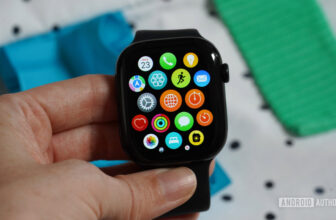
Before the first Pixel Watch launched, I tried an Apple Watch 6 and a Galaxy Watch 4 for a while. And one of the most simple features I appreciated about them was the grid view in the app drawer. Smartwatch displays are tiny, so fitting more icons on the same screen just makes sense from a usability perspective.
Samsung’s organized and customizable app drawer was perfect for me; I could trust it to sort apps alphabetically or manually move apps around to put the ones I wanted most on top. On the other hand, Apple’s approach really confused me with its lack of a consistent order. I’m a creature of habit and muscle memory, so I don’t like to see things moving around — even if they’re being sorted by most used. That doesn’t work for me unless I’m the one manually assigning a specific immovable place for them.
Still, this grid view was an awesome use of the tiny screen real estate, no matter what sorting and scrolling approach you prefer.
Grid view or list view, which one do you use on your smartwatch?
0 votes
Jimmy Westenberg / Android Authority
Left to right: Samsung Galaxy Watch 4, Apple Watch Series 6
Then, the first Pixel Watch launched, bringing together two of my biggest smartwatch requirements — Android compatibility and Fitbit integration — and I just had to make the jump. There were dozens of features I didn’t like or thought were missing at the time on Google’s first watch (which were later brought to the Pixel Watch 2), but one of the most annoying missteps kept nagging at me each time I opened the app drawer: icon lists.
See, Google decided that the best way to browse the 20+ apps it installed by default and all the apps you, the user, would add is by scrolling through a list of apps, three by three, to find the one you need. It is inefficient, slow, pointless, and an absolute waste of time.
Kaitlyn Cimino / Android Authority
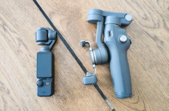
Google Pixel Watch 2
On a device that has a tiny screen to begin with, and with which I personally want to have the fewest possible interactions to get to what I need, I had to scroll with the crown or swipe with my fingers a few times to get to WhatsApp or Todoist or the Play Store, because they were seated toward the bottom of the alphabetical list.
In the back of my mind, I often calculated that it would take me more taps and time to open WhatsApp on my watch than to pull up my phone, unlock it, and use it there, so I ended up privileging the phone over the watch. And I used my watch less and less because of something as comically trivial as an app list.
Kaitlyn Cimino / Android Authority
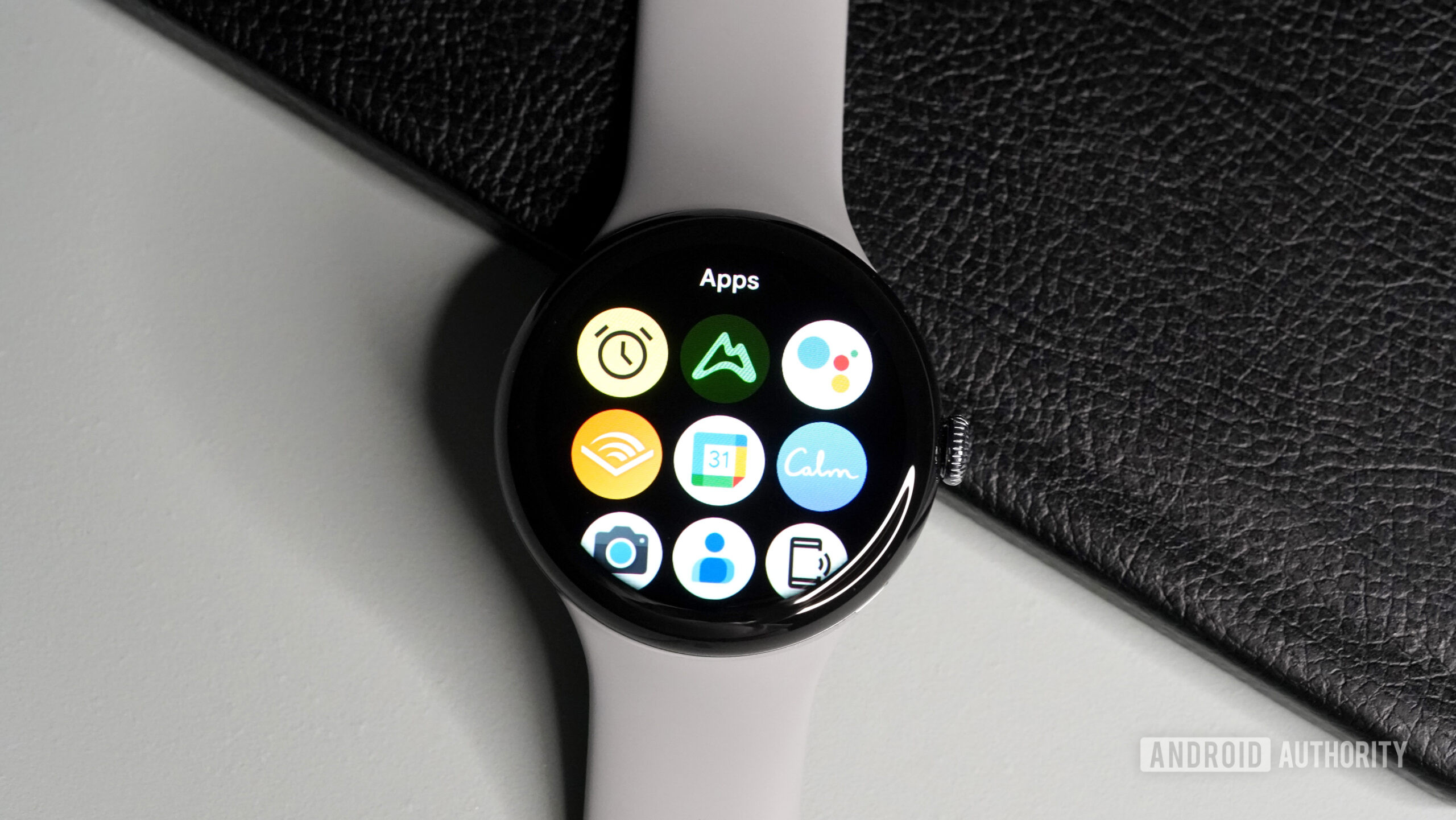
Then the Pixel Watch 3 launched, and with it finally came a second app drawer view option: grid. Ah, that sweet sight. It was the first setting I changed on my watch when I got it, and my colleague Kaitlyn also praised it as a monumental user experience change in her Pixel Watch 3 review.
No more time-consuming scrolling and swiping through apps three by three, now I can see nine app icons on my watch at the same time. Even with my own apps added, it only takes three swipes (four screens total) to see all icons and pick whichever one I want to use. This is faster, less annoying, and more efficient than the super-long app list. Plus, the icons themselves are larger than the ones in the app list view. So, for someone visually inclined like me, they’re easier to spot.
Grid view is the superior view for apps on the Pixel Watch 3 and I can’t wait until Google rolls it out to the older Pixel Watch models because there’s no reason this should be an exclusive for the latest model. And if you’re still clinging on to the list view, I’d love to know why (and I think you’re using your watch wrong).


