People HATE Apple’s New iOS 18 Photos App – Here’s Why…
Apple’s massively updated its Photos app for iPhone, turning it into a kind of social media-style app, complete with AI. People aren’t happy…
Apple’s iOS 18 Photos app brings a complete redesign, but not everyone is thrilled. While the app has introduced some cool features, it has also drawn criticism from users who find it cluttered, confusing, and less intuitive than previous versions.
Let’s break down the pros and cons of the new Photos app in iOS 18, and see if it’s worth the hype.
The New Camera App Inside iOS 18 Detailed, Warts & All…
 Pin
PinThe Good: What Works
Customization Options
One of the standout features of the new Photos app is its ability to be customized. You can rearrange menus and remove categories you don’t use, like Memories or Trips, which can help streamline your experience. For users who take the time to tweak the app, this can turn into a positive.
New AI-Driven Features
Like many other parts of iOS 18, the Photos app now leans heavily into AI. It automatically curates albums and generates slideshows based on your pictures. If you enjoy reviewing photos from past trips or events, this can be a fun feature—though it’s not for everyone.
Deep OS Integration
The Photos app integrates deeply with the rest of the iOS ecosystem, making it easy to share, tag, and organize photos across your iPhone, iCloud, and other Apple devices. If you’re all-in on Apple, this integration can’t be beat.
The Bad: What’s Not Working
 Pin
PinCluttered Interface
A common complaint is that the app feels cluttered and harder to navigate. With so many new features packed in, including intelligent albums and auto-generated content, users have to do a lot more scrolling and menu navigation to find what they need.
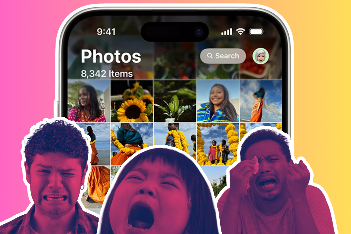
iOS 18 has rolled out with a lot of great updates, but there’s one change that really stands out—and not in a good way. The Photos app has ditched its tab-style interface, where we had four convenient tabs: “Library”, “Albums”, “For You”, and “Search”. Now, it’s all merged into a single-page, scrollable interface, which frankly, is a step back in terms of usability – r/ios
Many users compare it to Google Photos, noting that while both apps have become feature-heavy, Apple’s version feels less intuitive.
Full-Screen Viewing Issues
Another frequent grievance is that photos and videos no longer stay full screen when you interact with them. Scrubbing through a video or zooming into a photo now results in smaller, more limited views. For users who preferred the simplicity of full-screen interaction, this feels like a major step backward.
Poor Video Scrubbing and Timestamps
Scrubbing through videos has become more cumbersome, and the timestamp feature is no longer as easy to access. For those who frequently navigate through long video clips, this change is a notable downgrade.
Missing Features
Some beloved features are noticeably absent. For example, there’s no option to change the speed of slideshows anymore, and you can’t pin smart albums across devices. Users who relied on the old photo management tools are finding themselves frustrated with the lack of these options.
The Ugly: Major Usability Frustrations
Overload of Unnecessary Features
For many, the app’s new focus on intelligent albums and curated content feels like a distraction. Apple seems to be prioritizing vacation slideshows over practical photo organization. Users have complained that instead of making the app more functional, these features just make it more bloated.
Complex Navigation
The navigation within the app has been described as a “nightmare” by some users. With multiple tabs, new albums, and a mix of curated and user-created content, finding specific photos is harder than ever. Even basic tasks like moving photos into albums or finding recently deleted files can be confusing, especially in split-screen mode on iPads.
Final Verdict: A Step Forward or Backward?
 Pin
PinThe iOS 18 Photos app brings both improvements and frustrations. For users who like the new AI-driven features and don’t mind customizing their layout, the app can work well. But if you prefer a simpler, more streamlined experience, the cluttered interface, missing features, and navigation issues are going to go down like a turd-flavored ice lolly.
Here’s all the rest of the changes inside iOS 18 detailed in full (most of them are good, don’t worry!)